
The Best Logos something most marketing can’t, it makes people remember you before they even know what you sell. The best logos work in an instant. They’re simple enough to sketch on a napkin, distinct enough to spot across a crowded event, and flexible enough to look sharp whether they’re on a business card or blown up on a 20-foot inflatable arch.
That last part matters more than most people think. At TMP Inflatables, we’ve spent over 20 years turning the Best Logos into massive, physical experiences, custom inflatables, branded tents, character replicas, trade show displays. For the best logos vs all the rest, the difference almost always comes down to the same core design principles the icons on this list got right.
So whether you’re building a brand from scratch, refreshing your visual identity, or just a design nerd who appreciates good work, this list is for you. We broke down 14 of the best logos ever created, pulled out the specific design decisions that made them stick, and turned each one into a practical lesson you can apply to your own branding. No fluff, no design-school jargon, just clear takeaways from logos that have earned their place in the hall of fame. https://www.youtube.com/embed/TH-jqZ4xueI
1. The Best Logos Nike
The Nike Swoosh is arguably the most recognized mark on the planet, and it was designed in 1971 by a graphic design student named Carolyn Davidson for just $35. That gap between its origin and its current status tells you everything about how a simple, well-executed shape can outgrow any budget or timeline. It’s a logo that has scaled from sneaker tags to stadium billboards to, yes, the side of inflatable arches at major sporting events, without losing a single bit of its power.
What makes it iconic
The Swoosh works because it communicates motion without a single word. It’s a fluid, single-stroke shape that suggests speed, forward momentum, and athletic energy the moment your eye lands on it. It doesn’t rely on a company name, a color, or a complex illustration. The mark stands completely on its own, which is extraordinarily rare. Nike also made a bold call early on: they dropped the word “Nike” from most applications once the Swoosh became strong enough to carry the brand alone. Very few companies ever reach that point, but Nike got there by committing to one mark and repeating it relentlessly across every surface imaginable.
A logo that works without text is a logo that works everywhere.
Design lessons you can steal
The biggest lesson from the Swoosh is that meaning comes from association, not complexity. The shape itself is neutral. Over decades, Nike attached it to elite athletes, winning moments, and cultural movements until the mark absorbed all of that meaning. You don’t need to cram your brand story into the logo itself. You need a mark that’s clean enough to carry meaning once you build it. The second lesson is scalability. The Swoosh reads perfectly at 10 pixels and at 10 feet. That range matters enormously when your brand shows up across digital, print, and physical environments.
How to apply it to your logo
Start by testing your current logo at two extremes: the size of a favicon and the size of a large format display. If it loses clarity at either end, you have a complexity problem worth solving. Strip out any element that doesn’t survive both tests. Your goal is a mark that holds its shape and meaning whether it’s on a business card or printed across a 15-foot inflatable structure at your next event.
2. The Best Logos Apple
The Apple logo sits at the top of almost every “best logos” conversation, and for good reason. Rob Janoff designed the rainbow-striped bitten apple in 1977, and the basic silhouette has remained essentially unchanged ever since. That kind of consistency across nearly five decades is a design achievement most brands never come close to.
What makes it iconic
The Apple logo works because it’s instantly recognizable as a real object, yet no one mistakes it for a fruit company. The bite taken out of the apple is a small but critical detail. It establishes scale and orientation at a glance, so your brain processes the shape instantly without any effort. The mark is also perfectly symmetrical aside from that bite, which gives it visual balance while keeping it from feeling sterile.
Recognizability beats originality every time.
Design lessons you can steal
Apple’s logo teaches you that restraint is a design decision. When they moved from the rainbow version to a monochrome mark in 1998, they weren’t simplifying out of laziness. They were making the logo adaptable to any surface and context, from chrome hardware to a white retail bag to a massive event display. The lesson is that a great logo doesn’t need color to carry meaning.
How to apply it to your logo
Test your logo in pure black and white before you commit to any color version. If the mark loses its identity without color, the underlying shape isn’t strong enough yet. A solid silhouette travels across every format and material, including large-scale branded structures, without any degradation.
3. The Best Logos FedEx
The FedEx logo earns its spot on any best logos list through one of the most celebrated tricks in design history. Lindon Leader created it in 1994, and it hides a white arrow in the negative space between the “E” and the “x.” Most people walk past FedEx trucks every day without noticing it, and that’s part of what makes it so effective.
What makes it iconic
The hidden arrow isn’t decoration. It reinforces speed and forward direction, two qualities that are core to what FedEx sells, without adding a single graphic element to the design. The logo works on two levels at once: it reads as a clean, professional corporate wordmark at first glance, and then rewards a second look with a layered meaning built directly into the letterforms.
A logo that rewards attention builds a stronger connection than one that gives everything away immediately.
Design lessons you can steal
The FedEx arrow exists entirely in the negative space between letters, which means Leader shaped the typeface itself to carry a secondary message. That’s the real lesson: every part of your logo, including the empty space, is a design decision worth making deliberately. You don’t need hidden imagery, but you should treat negative space as an active element rather than leftover background.
How to apply it to your logo
Audit the spacing and gaps in your current mark. Small adjustments to letterforms or icon shapes can add visual interest without adding visual noise. A mark with intentional use of space reads more confidently at every scale, whether it’s on a screen, a banner, or a large-format inflatable structure at your next event.
4. The Best Logos McDonald’s
The Golden Arches rank among the most recognized symbols on earth, and the logo has earned its place in every conversation about the best logos ever created. Jim Schindler designed the arches in 1962 by incorporating the architectural shape of the actual McDonald’s restaurant buildings into a single, unified mark. What started as a literal building feature became a global brand icon worth billions.
What makes it iconic
The Arches work because they function as pure shape recognition. Color and form do all the heavy lifting here. The bold yellow “M” reads instantly at any size, in any context, whether it’s on a paper bag, a highway billboard, or a stadium display. McDonald’s also made a strategic call to keep the mark consistent across every market worldwide, which means decades of repetition have baked the symbol into cultural memory across every continent.
A shape repeated long enough becomes a signal, not just a symbol.
Design lessons you can steal
Yellow is not an obvious choice for a food brand, yet McDonald’s owns it completely. The lesson is that color specificity builds brand equity. Picking a distinctive color and committing to it across every touchpoint trains your audience to associate that color with you, not just your logo.
How to apply it to your logo
Pick one dominant color and use it with discipline across every branded surface, from your website to your printed materials to any physical displays. When your brand shows up on a large-format piece like an inflatable arch or branded tent, that color consistency does the recognition work before anyone reads a single word.
5. The Best Logos Coca-Cola
The Coca-Cola logo has been in continuous use since 1887, making it one of the oldest entries on any best logos list. The distinctive Spencerian script was hand-lettered by Frank Mason Robinson, the company’s bookkeeper, who chose the style because he thought the flowing letters would stand out in newspaper ads. He was right, and the world never looked back.
The Best Logos & What makes it iconic
The Coca-Cola mark works because the script letterforms carry warmth and familiarity that a sans-serif font could never replicate. The logo feels handmade, personal, almost nostalgic, even when it’s printed at 40 feet tall on a festival banner. It also owns its red-and-white color palette so completely that most people associate that exact shade of red with Coca-Cola before they even process the word.
Longevity builds recognition that no advertising budget can buy on its own.
Design lessons you can steal
Custom lettering is the core lesson here. A typeface you can download is a typeface your competitors can also download. Coca-Cola’s script is proprietary, which means no other brand can accidentally evoke it. If your logo uses a widely available font, consider customizing the letterforms even slightly to create something genuinely ownable rather than interchangeable.
How to apply it to your logo
Ask yourself whether your current typeface or mark is something another company could replicate with a single font download. If the answer is yes, work with a designer to add custom details that make it yours. Distinctive letterforms and strong color ownership both travel well across formats, from digital screens to large physical brand activations like inflatable structures and branded event displays.
6. The Best Logos Amazon
The Amazon logo might not earn the same immediate recognition as some of the best logos on this list, but it’s one of the most deliberately constructed marks in modern branding. Turner Duckworth refined the current version in the early 2000s, and the arrow running from A to Z underneath the wordmark carries a double meaning that most people process subconsciously before they ever consciously register it.
The Best Logos & What makes it iconic
The arrow does two things at once. It forms a smile shape, which communicates friendliness and customer satisfaction, and it points from A to Z, signaling that Amazon sells everything you could possibly need. Neither meaning requires explanation. Both land instantly. That’s the mark of a logo designed with genuine strategic intent rather than visual style alone.
Embedding your value proposition directly into the mark is always more powerful than spelling it out in a tagline.
Design lessons you can steal
Amazon’s logo teaches you that every visual element should carry strategic weight. The arrow isn’t decorative, it’s a compressed brand promise. The color choice, a warm Amazon orange, adds energy without feeling aggressive. The lesson is to interrogate every design decision and ask what work each element is actually doing for your brand.
How to apply it to your logo
Look at your current mark and identify any elements that exist purely for decoration. Then ask whether you could replace those elements with something that also communicates a brand value. When your logo scales up onto a large physical surface like an inflatable arch or branded event tent, every intentional detail reads louder and every filler element becomes noise.
7. The Best Logos Google
The Google logo sits in a unique position among the best logos ever created because it’s built entirely from a typeface, no icon, no hidden imagery, just four colors applied to six letters. Ruth Kedar designed the wordmark in 1999, and Google has refreshed it a few times since, most notably moving to a custom sans-serif in 2015 that dropped the serifs while keeping the playful, primary-color palette that audiences had come to expect.
The Best Logos & What makes it iconic
The Google logo earns its recognition through deliberate color rule-breaking. The primary colors, red, blue, and yellow, follow a predictable sequence until the second “g” breaks the pattern with green. That single deviation signals that Google doesn’t operate by conventional rules, which is a precise match for what the company actually stands for. The mark also scales without effort, working identically on a browser tab favicon and a massive conference display.
Breaking one rule intentionally is a design decision. Breaking rules at random is just noise.
Design lessons you can steal
The core lesson from Google is that color sequencing is its own form of communication. The logo uses the simplest possible building blocks, a clean typeface and four flat colors, and still manages to carry a distinct personality. You don’t need complex graphics when color and proportion are handled with precision.
How to apply it to your logo
Review how your current color palette interacts across every element of your mark. A single unexpected color choice, applied consistently and intentionally, gives your brand a personality that pure shape alone can’t deliver. That distinctiveness holds up whether your logo lives on a screen or gets printed large on a branded inflatable structure at an event.
8. The Best Logos Starbucks
The Starbucks Siren logo has gone through several evolutions since the brand launched in 1971, but the most decisive move came in 2011 when Starbucks removed the company name entirely from the mark. That decision put Starbucks in rare company alongside Nike and Apple as brands confident enough in their visual identity to let the image stand completely alone.
The Best Logos & What makes it iconic
The Siren works because she’s distinctive without being generic. The circular frame, the symmetrical figure, and the high contrast all work together to create a mark that reads instantly whether it’s on a coffee cup, a storefront window, or a large-format event display. Starbucks also made the green ownership play as effectively as any brand in the best logos conversation, meaning that specific shade of green now belongs to them in most consumers’ minds before they process another detail.
Owning a color is a long-term brand asset, not a short-term styling choice.
Design lessons you can steal
The key lesson is that evolving a logo gradually preserves recognition while allowing modernization. Each Starbucks refresh simplified the mark rather than replacing it, stripping back detail while keeping the core Siren shape intact. Your audience builds recognition over time, and drastic redesigns reset that investment every time you make them.
How to apply it to your logo
When you update your logo, keep at least one core element constant, whether that’s color, shape, or the primary mark itself. That continuity carries recognition forward across every touchpoint, from your digital presence to physical brand activations like large-format inflatable structures at live events.
9. The Best Logos Chanel
The Chanel double-C monogram earns its place among the best logos ever created through a combination of geometry, restraint, and cultural weight. Coco Chanel herself created the interlocking C mark in 1925, and in over a century of use, it has never needed a meaningful redesign. That kind of staying power doesn’t happen by accident.
The Best Logos & What makes it iconic
The double-C works because it functions as pure geometric symmetry. Two mirrored Cs interlock without overlapping awkwardly, creating a mark that reads as both a monogram and a standalone icon. The logo also benefits from unwavering consistency: Chanel has never diluted the mark with seasonal redesigns or trend-chasing updates, which means every generation encounters it as something timeless rather than dated.
Consistency applied over decades turns a mark into a cultural symbol.
Design lessons you can steal
Chanel’s logo teaches you that monograms are underused in modern branding. Two letters, handled with precision and balance, can carry more identity than a complex illustration ever could. The second lesson is that black and white is a complete palette when the underlying shape is strong enough. Chanel rarely needs color to signal luxury.
How to apply it to your logo
Test whether your initials or brand abbreviation could form a mark that stands on its own. A well-constructed letterform or monogram scales cleanly across every format, from a small embossed label to a large-format inflatable display at a live event, without losing any of its identity or precision along the way.
10. The Best Logos Adidas
The Adidas Three Stripes have been part of the brand since 1949, but the mountain logo most associated with Adidas today was introduced in 1991 by designer Peter Moore. It belongs in any serious conversation about the best logos ever made, not because it’s complex, but because three parallel lines arranged into a simple peak communicate an entire brand idea with almost no effort.
The Best Logos & What makes it iconic
Built from three angled bars stacked into a mountain silhouette, the mark translates Adidas’s core idea (progress, challenge, reaching higher) into pure shape. No context, no supporting text, and no additional imagery required. Adidas also benefits from one of the strongest pattern-based marks in modern branding: the Three Stripes appear on products, packaging, and physical structures in a way that functions as a logo even when no wordmark is attached.
A mark built from pattern logic can brand a surface, not just a product.
Design lessons you can steal
Adidas proves that geometric simplicity scales without limits. Three lines at the right angle carry the entire brand identity across every format, from a woven shoe tag to a stadium-sized display. Your logo and your brand pattern can function as the same visual asset, which effectively doubles the surface area where recognition happens without adding any visual complexity.
How to apply it to your logo
Ask whether your current mark could work as a repeating pattern or texture across a branded surface. A logo that tiles or extends cleanly performs especially well on large physical formats like inflatable arches and branded event structures, where the surface itself becomes a recognition opportunity rather than just a backdrop.
11. The Best Logos Shell
The Shell logo earns its place among the best logos ever created as one of the clearest examples of a pictorial mark done right. Raymond Loewy refined the current version in 1971, pushing the scallop shell design toward bold geometry and flat color after decades of gradual simplification that started in the early 1900s. The result is a mark so clean and confident that Shell rarely needs to display its name alongside it.
The Best Logos & What makes it iconic
The Shell mark works because it reduces a natural object to its essential geometric form without losing the reference to what it actually is. The scallop shell is rendered in thick, confident lines that hold up perfectly at any scale. Shell also owns its red and yellow color combination so completely that the palette alone signals the brand across highway signage, fuel station displays, and major sponsorship assets worldwide.
Simplifying a natural object to its geometric core is almost always a stronger strategy than illustrating it in detail.
Design lessons you can steal
The Shell logo teaches you that pictorial marks age better when they’re built from geometry rather than illustration. A detailed, realistic image dates itself quickly because it locks you into a specific illustration style. A simplified, flat representation of the same subject stays relevant across decades because the underlying shape carries the meaning without any stylistic baggage.
How to apply it to your logo
If your current mark features an illustrated object, test a flattened, geometric version of it. Reduce the shapes to their core forms and check how they hold up at both small and large scales. Marks built from clean geometry print well on every surface, from a business card to a large-format inflatable structure at your next event.
12. The Best Logos Target
The Target bullseye logo holds a firm spot among the best logos ever created, and it’s one of the few marks that works as both a product icon and a complete brand identity. The design traces back to 1962 when Target stores first opened, and the current simplified two-ring version was refined over the following decades into the clean, graphic mark the brand uses today.
The Best Logos & What makes it iconic
The bullseye works because it delivers instant, universal recognition through the simplest possible geometry. Two concentric circles with a central dot create a mark that your brain processes faster than any wordmark ever could. Target has also made the brand decision to carry the logo’s red-and-white color system into every physical and digital touchpoint with remarkable consistency, making the palette itself a recognition signal that arrives before the shape even registers.
A mark that works as a standalone symbol in a single color has solved the hardest problem in logo design.
Design lessons you can steal
Target’s bullseye proves that geometric shapes require no narrative explanation to carry brand meaning. The shape doesn’t tell you what Target sells; it simply tells you where to look, which is exactly the brand idea. The lesson is that abstract geometric marks age far better than concept-heavy illustrations because they don’t lock you into a specific cultural moment.
How to apply it to your logo
Test your current mark by removing all color and checking whether the underlying shape reads clearly on its own. A strong geometric form survives that test at every scale, from a digital icon to a large-format branded inflatable structure at a live event.
13. The Best Logos London Underground
The London Underground roundel is one of the most studied marks in design history. Created in 1916 by Edward Johnston, the red circle bisected by a blue horizontal bar is a functional wayfinding icon that became one of the best logos ever produced by a public institution. It has guided millions of commuters through one of the world’s most complex transit systems for over a century without a single meaningful reinvention.
The Best Logos & What makes it iconic
The roundel works because it solves a practical navigation problem with total visual clarity. A red ring and a blue rectangular bar create instant contrast and directionality, telling your eye exactly where to look before your brain processes any text. Johnston designed it specifically for underground stations with low light and fast-moving crowds, and those tight constraints produced a mark that now scales perfectly across every context it appears in, from tiled station walls to global merchandise.
Design lessons you can steal
The core lesson from the London Underground mark is that functional constraints produce better design than unlimited creative freedom. Johnston built the roundel around a specific, practical need, and that discipline resulted in a mark with zero unnecessary elements. Every shape serves the wayfinding purpose first and the brand identity second, which is exactly why it still works more than a hundred years later.
Designing for a specific problem almost always produces a stronger mark than designing for general appeal.
How to apply it to your logo
Before your next design session, define the single most important job your logo needs to do. Then strip your mark down to only the elements that serve that function directly. A logo built around one clear purpose travels well across every surface, from a small digital avatar to a large-format inflatable structure at a live event.
14. The Best Logos Mastercard
The Mastercard logo rounds out this list of the best logos ever created with a mark that has only gotten stronger through simplification. The overlapping red and yellow circles date back to 1966 when the company first launched, but the most significant evolution came in 2019 when Mastercard dropped its wordmark entirely from the symbol, leaving two interlocking circles to carry the brand on their own.
The Best Logos & What makes it iconic
The overlapping circles work because they communicate partnership and connection through pure geometry without requiring a single word of explanation. The red and yellow intersection creates an orange overlap zone that adds visual depth to what would otherwise be a flat, static mark. Mastercard’s decision to remove the company name from the primary symbol places it in rare company alongside Nike and Apple as brands whose visual mark has outgrown their wordmark.
Two simple shapes, positioned with precision, can carry more brand meaning than a complex illustration ever could.
Design lessons you can steal to create the best logos
Mastercard proves that color overlap and layering create visual interest without adding complexity. The mark uses only two circles and three color zones, yet it communicates a complete brand idea. The lesson is that strategic relationships between shapes often deliver more meaning than adding new elements to your mark.
How to apply it to your logo
Check whether your current mark uses multiple elements that could interact with each other rather than sitting side by side. Overlapping or intersecting shapes add sophistication without adding noise, and they hold up cleanly at any scale, from a small digital icon to a large-format branded inflatable structure at a live event. See More Design Lessons Here
Next Steps
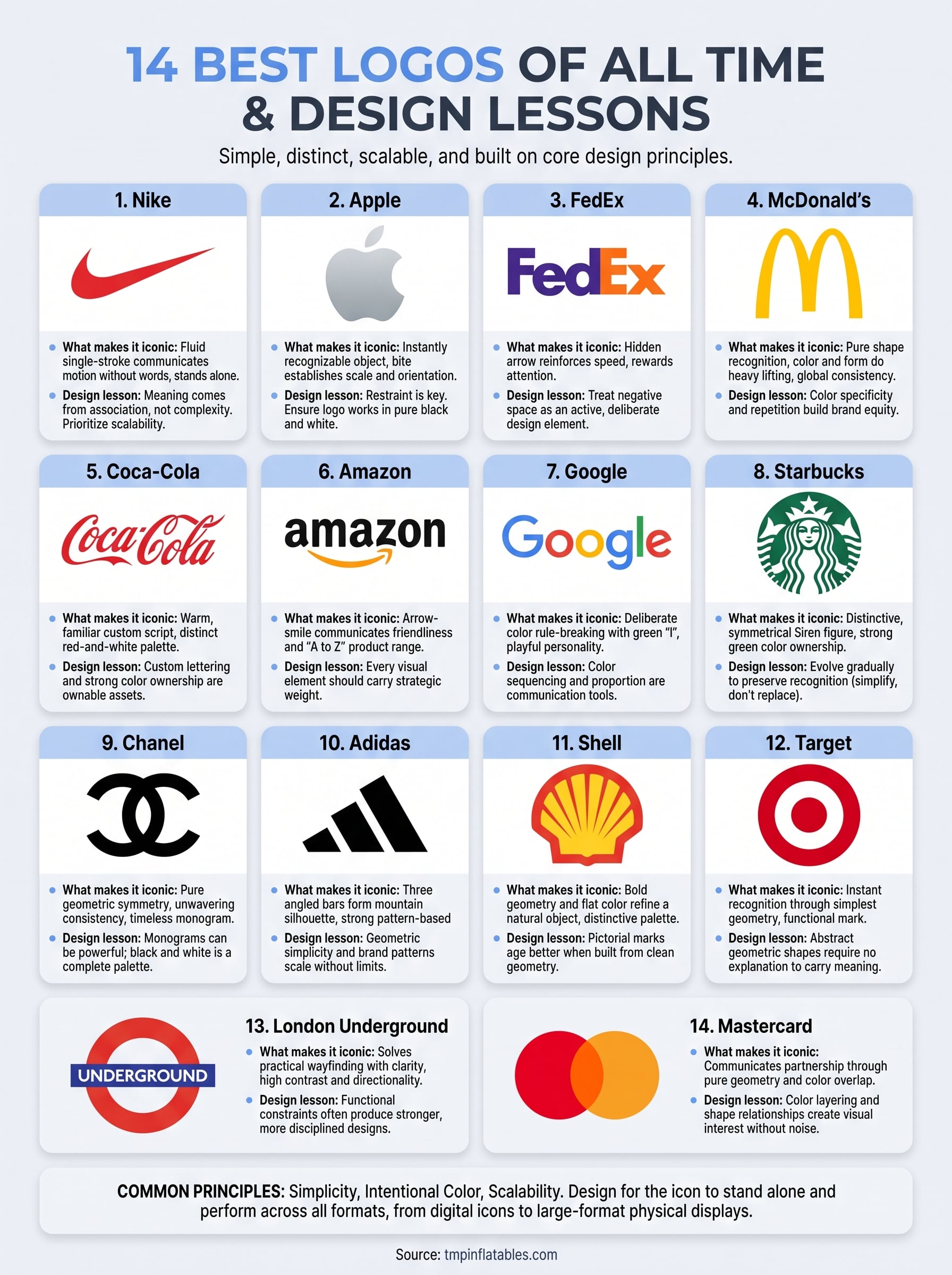
Every logo on this list got to iconic status through the same handful of principles: simplicity, intentional color use, and a mark that holds up at any scale. Whether you’re building a brand from scratch or refreshing an existing identity, the best logos all share one quality worth chasing, they communicate something clear before the viewer consciously tries to read them.
Your brand doesn’t stop at a screen. It shows up on physical surfaces, at live events, on trade show displays, and at activations where your mark needs to carry full recognition from a distance. The design decisions you make now will either hold up in those environments or fall apart. A strong, scalable logo makes every physical brand asset perform better, from a simple banner to a custom inflatable arch at a major event. If you’re ready to see your brand identity brought to life at scale, request a quote for a custom inflatable and we’ll help you get there.